Understanding Sales Funnel Opportunities and How to Maximize Them

Sales teams miss money every day. Not because the product is bad. Because they can’t see where deals actually break down.
This happens when sales funnel opportunities aren’t visualized. Deals sit in stages without anyone noticing. Weak reps keep struggling because no one catches the pattern. Pipeline value looks healthy until it suddenly doesn’t. Visualization fixes this. It shows exactly where opportunities get stuck.
This guide walks you through the seven metrics that move revenue through sales funnels, how to set up a dashboard to track them, and what patterns most teams miss. You’ll know exactly where to focus.
Key Takeaways:
Why Do Most Funnels Stay Broken?
Sales managers track numbers. But numbers in a spreadsheet don’t move people to action. A 40% drop-off at the proposal stage is a fact. A dashboard showing your five best reps at a 62% win rate and two struggling reps at a 28% win rate is a conversation starter.
Visualization turns data into decisions.
When funnel data is visible, teams stop reacting to surprises. Instead, they identify weak spots showing up across three reps. They spot the rep as great at prospecting but failing at closing. They notice the average deal takes 67 days, when the best rep closes in 32.
What Actually Matters: The 7 Metrics That Drive Revenue
Most teams track 30 different numbers and still miss what’s killing revenue.
These seven metrics move the needle.
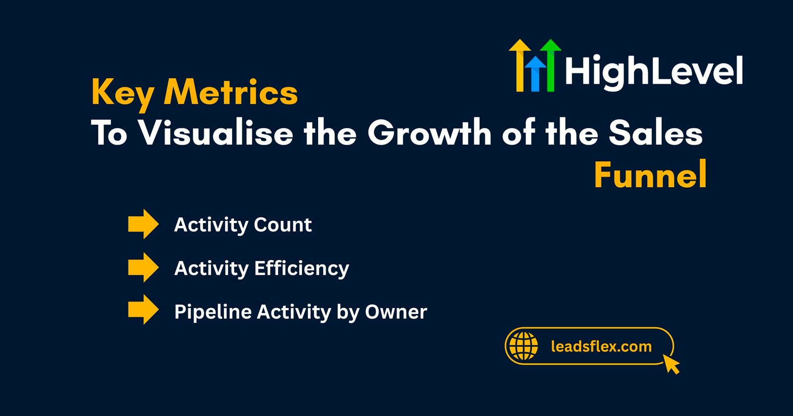
Activity Count
Raw output. How many calls, emails, and meetings did each rep complete this week? Rep A made 40 calls, and Rep. B made 15. Activity count tells you who’s working harder. Working harder doesn’t always mean closing more.
Activity Efficiency
The gap between busy and productive. A rep who makes 20 calls and generates 5 opportunities is twice as efficient as one who makes 40 calls and generates 4.
Efficiency reveals coaching opportunities. High activity but low opportunities? The pitch is weak, the qualification is off, or they’re calling the wrong people.
Pipeline Activity by Owner
Deals aren’t equal. A $100K deal deserves more attention than a $5K deal. This metric shows whether reps are spending time proportionally. If someone burns 20 hours on a small deal, they’re leaving bigger ones on the table.
Pipeline Value
The raw dollar amount in your pipeline tells you revenue capacity. What matters is direction. A 15% month-over-month climb is good. If it drops or stays flat while adding deals, something’s falling through.
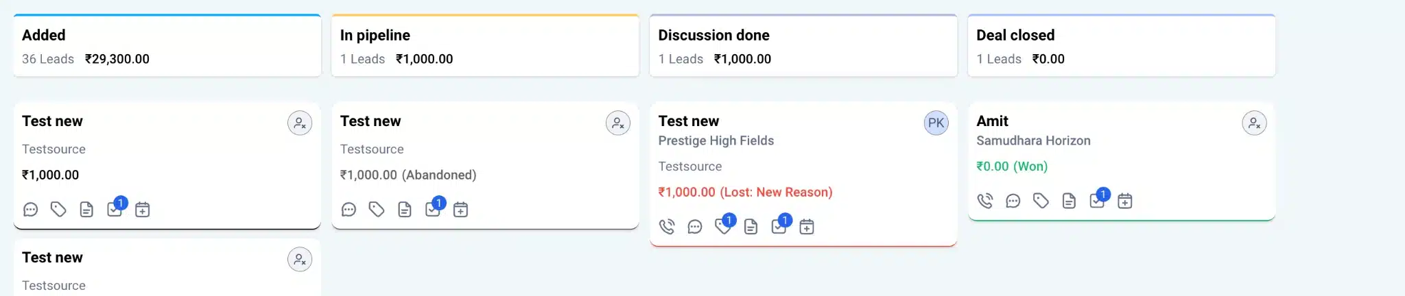
Funnel Analysis
Where do leads actually leave? Some drop at the first qualification call. Others go deep into proposals, then ghost. The fix is different for each stage. Early dropoff usually means bad lead quality or poor qualification. Late-stage loss means weak proposals or weak objection handling.
Sales Cycle Duration
How long does it take to close? Thirty days? Ninety? Measure by rep, deal type, and industry. When the fastest rep closes in 45 days and the slowest in 120, there’s a training gap. Shorter cycles mean faster cash flow and more capacity.
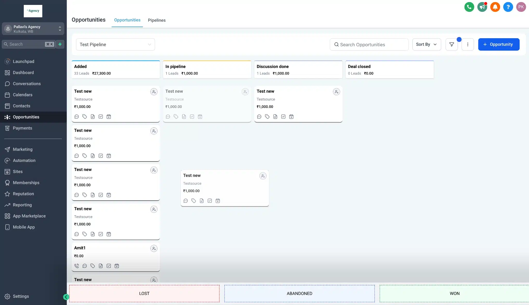
Win Rate
Of all the deals reps take to close, what percentage actually convert? Best reps sit around 50-65%. Average teams hover at 35-45%. This number ties everything together. If activity is steady and efficiency is solid, but the win rate dropped 10 points, something broke.
These seven metrics create a complete picture.
How to Actually Set Up Visualization?
Reading about metrics doesn’t help. Build a dashboard.
Step 1: Pick Your Tool
If on GoHighLevel, use the built-in opportunities dashboard. No additional software needed. GHL tracks all seven metrics natively. Salesforce, HubSpot, and other CRMs have reporting features. For smaller teams with simple needs, a Google Sheet with formulas works. Start there before buying expensive tools.
Step 2: Connect Your Data
CRM data should feed directly into the dashboard. Automatic data flow beats manual entry. Pull opportunities, deal value, stage, owner, date created, date closed, and status (won, lost, open, abandoned) automatically. Set it and forget it.
Step 3: Build Your Layout
Start simple. Add one metric per widget. Don’t cram everything into one view. One metric per section. Arrange so the most critical sits at the top.
Step 4: Set Baseline Numbers
Don’t just look at raw metrics. Establish targets. If the industry average win rate is 45% and you’re at 38%, that gap is actionable. If the average sales cycle is 50 days and yours is 75, investigate the 25-day slowdown.
Step 5: Review Weekly
Check the dashboard every Monday morning. Sixty seconds. What changed? Did activity spike, but win rate drop? Did one rep’s efficiency tank? Did pipeline value grow? Weekly reviews catch problems before they compound.
How Does Visualization Helps In Business Growth?
This table will show each stage along with its focus area and growth opportunity. Read it carefully.
| Sales Funnel Stages | Focus Area | Growth Opportunity / Strategy |
| Awareness | Building visibility | Run paid ads, social media campaigns, and SEO blogs to attract a wider audience |
| Interest | Capturing attention | Create engaging videos, lead magnets, and free resources to gain trust |
| Consideration | Product evaluation | Offer product demos, comparison charts, and case studies |
| Intent | Purchase decision | Simplify checkout, provide discounts or limited offers |
| Purchase | Conversion | Improve UX, show testimonials, use one-click purchase options |
| Retention | Customer loyalty | Improve with loyalty programs, follow-up emails, and exclusive deals |
| Advocacy | Word-of-mouth promotion | Encourage visitors to refer, collect customer reviews, and share success stories |
What Does Visualization Reveals?
Visualization shows patterns no spreadsheet hides.
Common Mistakes When Visualizing Your Funnel
Tracking Everything at Once
Don’t put 30 metrics on a dashboard. Focus on the seven. Everything else is noise.
Ignoring the Drop-Off Points
Huge drops from prospecting to qualification or from proposal to negotiation? That’s the problem. Everything else is secondary.
Treating All Deals Equally
A $5K deal and a $50K deal shouldn’t get the same pipeline attention. Visualize by deal size. Adjust workflows accordingly.
Forgetting Why Numbers Matter
Numbers matter because they show where to coach. Poor activity efficiency? That’s the coaching conversation. “Make more calls” isn’t coaching. “Your efficiency is 30% below the team average. Let’s listen to three of your calls” is coaching.
Not Acting on What You See
A dashboard only works if there’s a response. One rep stuck at 28% win rate? That’s a conversation. Pipeline value flat? That’s a hiring or prospecting problem. See it, then fix it.
Mapping Opportunities to Growth: From Awareness to Advocacy
Every stage of the funnel needs a different focus.
Awareness Stage
Focus on visibility. How many people know you exist? Track through website visits, content engagement, and ad impressions. Tie website analytics into the sales dashboard to see which channels produce the most qualified leads.
Interest Stage
Leads downloaded something, watched a demo, and filled out a form. Still potential. Track how many awareness-stage people move here. If only 3% of leads show interest, the offer isn’t resonating.
Consideration Stage
Prospects are comparing you to competitors. They’ve requested a demo or consultation. Track how many make it here and why others fall off. This is the qualification stage.
Intent Stage
Purchase is close. They’ve requested pricing or proposed a deal. Track time in this stage. If deals sit here 45+ days, the negotiation process is slow, or pricing isn’t aligned.
Purchase Stage
Deal closes. Won. Measure the close rate from intent to purchase. Compare by rep and by deal type.
Retention Stage
Customer stays, pays, doesn’t churn. Track renewal rates, expansion opportunities, and support tickets. This is where long-term revenue lives but often gets ignored.
Advocacy Stage
Happy customers refer others or leave reviews. Track referral rates and repeat business. Companies that systematically drive advocacy grow exponentially.
Most teams obsess over purchases. Smart teams measure retention and advocacy because that’s where profitability lives.
GoHighLevel Specific Setup
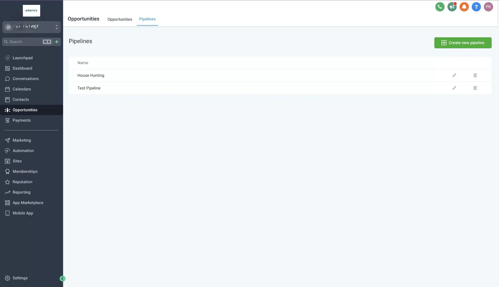
GoHighLevel has opportunities built in.
When a prospect shows buying intent, create an opportunity. Tag which pipeline they’re in. Set deal value. Assign an owner. As the deal progresses, move it through stages. Each stage change should trigger an automation follow-up email, task assignment, or manager notification.
GHL’s dashboard shows all seven metrics natively. The pipeline health widget displays the value by stage. Funnel analysis shows where deals drop. Activity reports show call, email, and meeting counts. Win rate and cycle time are calculated automatically.
Set up two automations. First, when an opportunity moves to “lost,” send the rep a task asking why. Not to blame. To learn. “Competitor?” “Budget?” “Wrong fit?” Capture reasons and patterns that emerge.
Second, when an opportunity sits in one stage 10+ days past average, notify the owner’s manager. Sometimes deals need a push.
Read this: Should You Have a Different Domain for Each Sales Funnel?
Conclusion
Sales teams that visualize beat those that don’t.
Spot weak reps faster. Identify which processes are broken and which work. Forecast accurately. Coach specifically instead of broadly. Know exactly where to focus.
The 7 Key Metrics are the roadmap. The dashboard is the view. Weekly reviews are a discipline.
Build those three. Everything else follows.